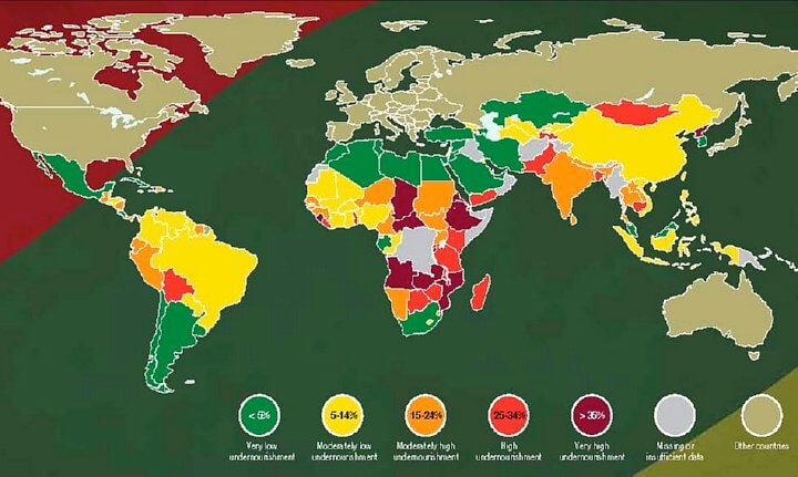
Where is the Hunger?
- Light Gray: Insufficient Data
- Burgundy color: > 35%
- Orange/Red: 25-34%
- Yellow/Orange: 15-24%
- Yellow: 5-14%
- Green: < 5%
This map shows the prevalence of undernourishment in the total population of Developing Countries as of 2006-2008 (the most recent period for which complete data is available). Undernourishment exists when caloric intake is below the minimum dietary energy requirement (MDER).
 Prevalence of undernourishment in Developing Countries
The MDER is the amount of energy needed for light activity and a minimum acceptable weight for attained height, and it varies by country and from year to year depending on the gender and age structure of the population. Map source: Food and Agriculture Organization of the United Nations.
Africa’s population more than tripled during the second half of the 20th century, growing from 230 million to 811 million.The United Nations projects by 2050, that Sub-Saharan Africa’s population could be almost three times Europe’s and by 2100 might even be three-quarters of the size of Asia.
Nigeria, Africa’s most populous country at 158 million, is expected to grow to 730 million by century’s end, making it larger than Europe’s projected population of 675 million. By any measure, Africa is by far the fastest-growing continent. Sub-Saharan Africa’s current population, at 856m, is little more than Europe’s and a fifth of Asia’s.
The consumer who pays the largest percentage of their spending on food, is hit the hardest when it comes to food prices. See this interactive map (civileats.com) to find what percentage of each country’s citizen’s spending goes toward food. Indonesia 43, India 35, China 32%.


Leave a Reply